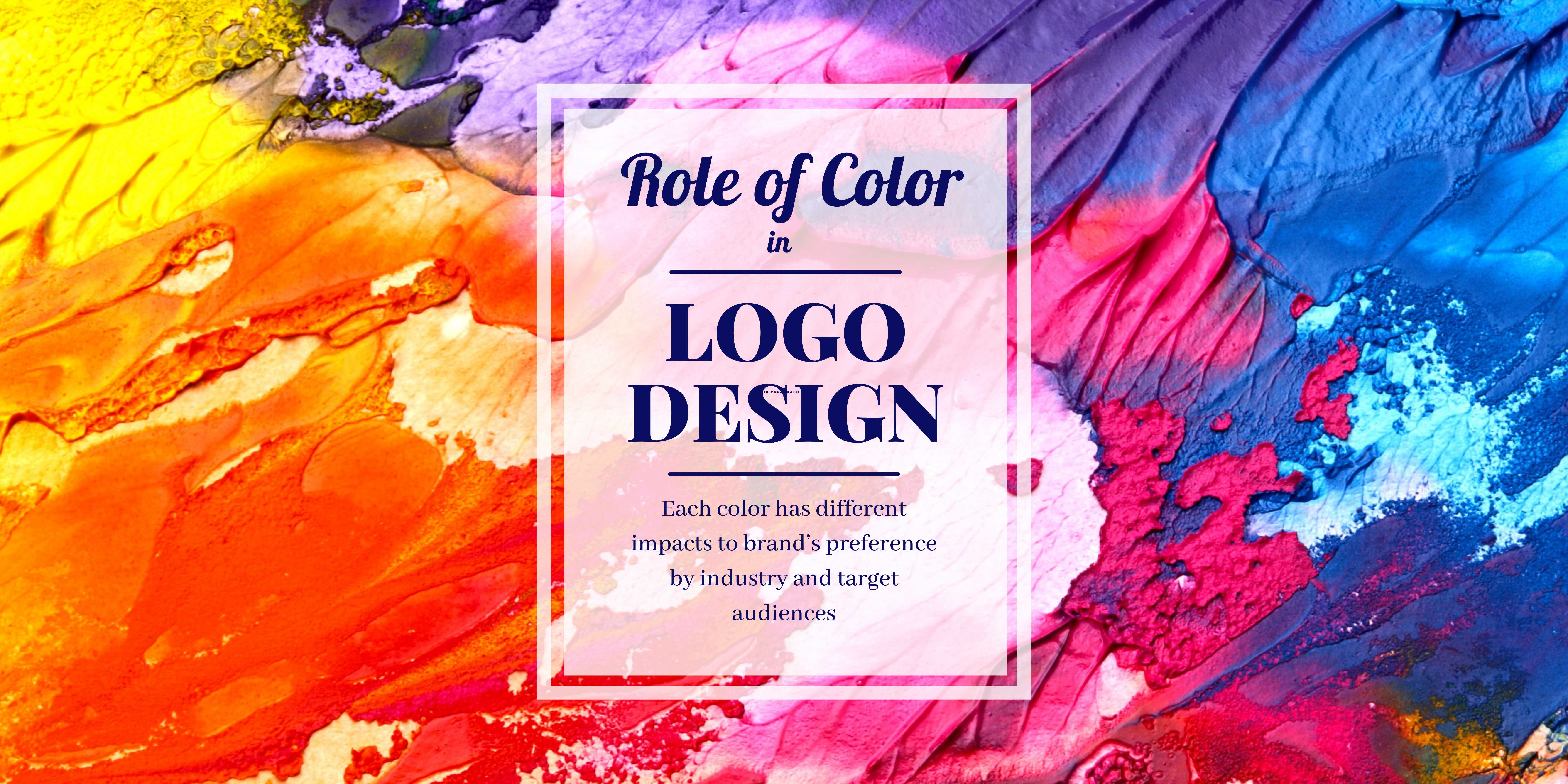
Choosing the best colors for a logo design depends on various factors, including the industry, target audience, brand personality, and cultural considerations. However, certain colors are commonly associated with specific emotions and can evoke particular responses from viewers. Here are some commonly used colors in logo design and their associated meanings:
- Blue: Blue is often associated with trust, reliability, and professionalism. It’s a popular choice for corporate logos and brands in industries such as finance, technology, and healthcare, services.
- Red: Red is a bold and attention-grabbing color that symbolizes energy, passion, and excitement. It can create a sense of urgency and is often used by brands in the food, beverage, and retail industries.
- Green: Green is commonly associated with nature, growth, and freshness. It’s often used by brands that want to convey a sense of environmental responsibility, health, and wellness.
- Yellow: Yellow is a cheerful and optimistic color that symbolizes happiness, warmth, and energy. It’s often used by brands in the food, entertainment, and retail industries to attract attention and create a sense of positivity.
- Orange: Orange is a vibrant and energetic color that combines the warmth of red with the optimism of yellow. It’s often used by brands that want to convey a sense of friendliness, creativity, and enthusiasm.
- Purple: Purple is associated with luxury, royalty, and sophistication. It’s often used by brands in the beauty, fashion, and wellness industries to convey a sense of elegance and exclusivity.
- Black: Black is a classic and versatile color that symbolizes sophistication, elegance, and authority. It’s often used by luxury brands and businesses that want to convey a sense of professionalism and timelessness.
- White: White is often associated with purity, simplicity, and cleanliness. It’s commonly used as a background color in logo design to create contrast and emphasize other colors or elements.
When choosing colors for a logo design, it’s important to consider how they will be perceived by your target audience and how they align with your brand’s personality and values. Additionally, consider the cultural implications of color choices, as certain colors may have different meanings in different cultures. Ultimately, the best color choices for a logo design are those that effectively communicate your brand’s message and resonate with your audience.
Contact GKOF for further advice on logo & brand identity design